UX Rules: Four Rules for Form Controls
- February 20, 2009 12:46 PM
- User Interface Design
- Comments (2)
 Time again for another user experience rule, and this time I couldn't stop at just one. I've got four rules for you about forms; one of the most daunting aspects of UX design. You can save yourself some trouble with the following rules:
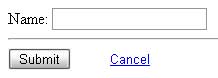
Rule 2: Ditch the Reset button.
Rule 3: Make your Cancel button look like a link, or make it visually washed out compared to your Submit button.
Rule 4: Make sure that there is at least a 2em distance between your Submit and your Cancel buttons.
Rule 5: Submit on the left, Cancel on the right.
Read more to see my reasonings and an example.
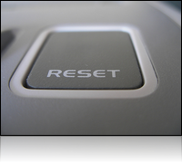
Reset
When was the last time you intentionally reset a form? If you've made a mistake, which is faster: to click the form and make the change, or to click "Reset" and then go back in and fill in whatever information you lost, and then finally correct the problem? In todays word clearing out the whole form is probably the last thing that anyone wants to do.
If you have a form that is so complex that a user might need to start completely over, you need to know somethings wrong with the rest of your interface design. Even if the use does want to start over, why can't they Cancel and then click back to the form? Its the same number of button clicks (one to reset, one to reach the top of the form).
Having a reset button is more likely to be hit on accident then intentionally, and its going to frustrate your users every time.
Cancel
No matter what a form is designed to do, the last action that you probably ever one your user to cancel out of the form. They came to your form for a reason, so should only cancel if your form scared them off or if they changed their minds. In either case, you should make sure that users don't hit Cancel unless they really do want to cancel. Its just as a dangerous as a Reset, but unlike a Reset, your users actually do need a way out of your form (not providing a way back is probably worse then them hitting the button accidentally).
So, you need Cancel, but you want your users to click it only if they really need to cancel. The answer is to make it visually less impacting than the Submit button. This keeps users from even "seeing" the button unless they look for it.
Spacing and Positioning
Put your Submit button on the left, since users look for it in-line with the for values. Your cancel should be to the right so it stays out of the direct line users follow down a form. This decreases the likelihood that a user will just run down the list and hit button that looks most appropriate.
Make sure that your Cancel button is outside of the threat range of sloppy clickers. You know who I'm talking about: your dad who clicks anywhere and everywhere around a button until he happens to hit it. A space of at least 2em gives you enough of a buffer that even your dad should hit be able to avoid hitting Cancel on accident.
The Exceptions
As I said in my last post, these rules aren't set in stone. A good example of when you need to flex these rules is when dealing with paginated, or "wizard" forms.
Example

Comments
I'm going to disagree with you on that one; while I think that its natural behavior for users to scan a page from top left to button right, I don't think that that means that your submit button should be on the right. Once a user starts working through your form, their eye movement is going to either move in a straight line down your form, or in a Z pattern across the input text to the input fields. In either case, putting your submit button on the right (lined up with your input fields) means that your users are going to scan over the Submit button before the Cancel button. That means your users find the option they want faster. Why make them look at 2 buttons rather than just one?
To see if my thinking pans out, I looked up the sign-ups for Twitter, Facebook, YouTube, and Ebay, and as of today all of their sign up forms have their submits where I described. They do trump my rules in one area though: they have all taken the plunge to simply remove the cancel button. This is probably becoming a safe assumption as your users are increasingly familiar with the browser and its ability to go back if they want to escape a form.
There is one exception to this rule, and thats the case of paginated forms, since "left = older, right = newer" is a fairly straight forward metaphor. You can read the article I linked in the main post to view some more in depth thoughts on that subject.