UX Rule: Notification of Completion
- February 19, 2009 5:29 AM
- User Interface Design
- Comments (3)
So, as I move into exploring the realm of user experience(UX), I'm going to work on building a collection of rules for creating good user experiences. These rules are fast, but they aren't hard: every situation is different, and although these rules will be starting points, some negotiation may be required.
Rule One: All processing must display a notification to the user.
Read more to see my thoughts on when and how to do this.
Why Notifications?
Without a visual notification that the user's action was accomplished, the user may not realize that the desired action was completed. They might also not know that they caused something to happen unintentionally. For example, if you have a list of articles and a link to delete the article, the user might not notice that they accidentally hit the link.
When and What to Notify
Every display page that appears after some kind of processing is complete should display a notification to the user that the processing was accomplished. If the processing is accomplished via Ajax, then the notification should display in real time on the current page.
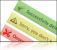
Notifications generally come in one of four flavors:
- Success – The user completed an action, such as saving, updating, or deleting a record.
- Failure – An action failed to complete due to an error, such as missing information or an actual error like failing to connect to a database.
- Warning – An action could not be completed due to something within the scope of the application, such as insufficient privileges to complete the action.
- Information – The user needs to be made aware of some information about the action.
How to Display a Notification
Notifications should be displayed at the top of the standard content area, below any normal headers or navigation. They should be made to stand out from the normal design by means of margins and spacing, but should still blend with the visual design of the site. Commonly these messages should be marked up with the standard color scheme listed below, but that does not prove to be sufficient for color blind users. In these cases, an icon and text notification should be used as well.
- Success – Green is the predominate color. Common icons are check marks.
- Failure – Red is the predominate color. Common icons are X's.
- Warning – Yellow or orange are used most often. Common icons are exclamation points.
- Information – Blue or gray work well for information. Common icons would be I's, or question marks.
If an action caused the creation of a record, or changes to a record, that record should be highlighted on the page as well. This will further help to indicate to the user which record was created or changed. Also, all notification messages should be a specific as possible. For example, rather then just saying "Record Deleted", you should say "User record for Jon Hartmann has been deleted."

Comments
http://www.stanlemon.net/projects/jgrowl.html