Visual Design in Diagrams
Written on 2026-01-22 by Jon Hartmann
The Starting Point
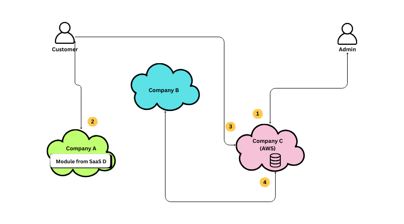
I sat in on a recent cross-team meeting within my enterprise and saw a diagram presented that I felt exemplified a skill gap that I think most software engineers face: they have no visual communication skills at all.
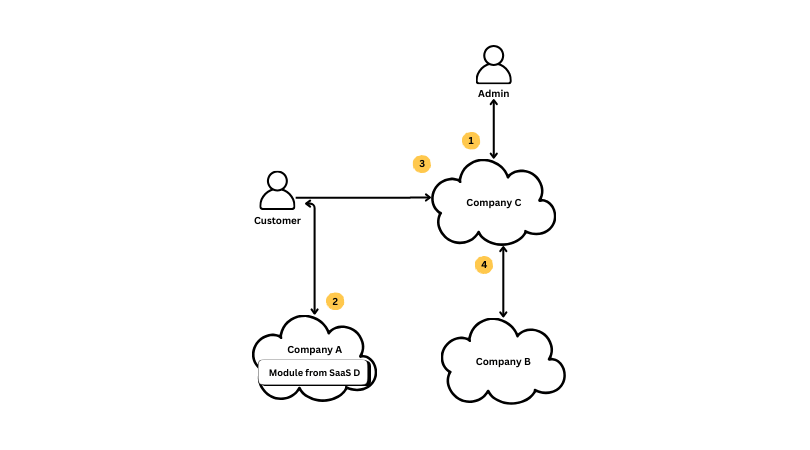
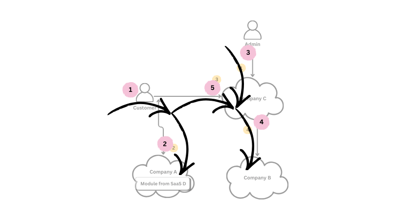
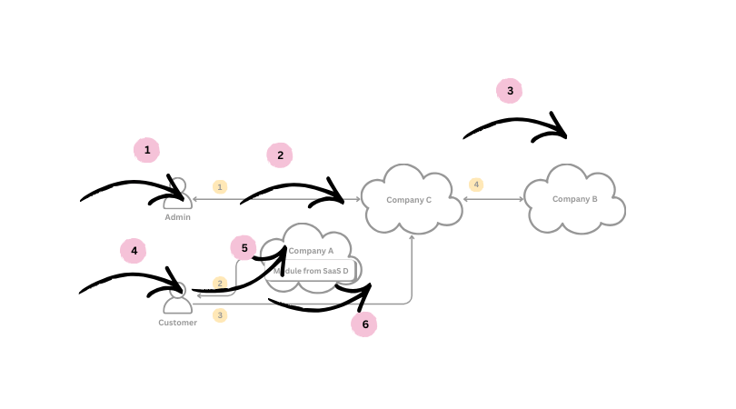
I recreated this version from a screenshot to take off identifying information, but I preserved a great deal of the design (although, believe it or not, this actually has already been simplified):
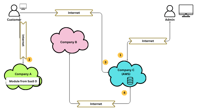
I see diagrams like this a lot and while I'm always glad that there is at least a diagram to review, I can't help but think about how much more useful the diagram could be. A diagram is a tool for communicating an idea visually, with the goal of offering increased clarity to the Audience, and so anything that gets in the way of that goal is a problem. When I look at this diagram, I see a lot of things that don't enhance my understanding of the system, and I'm going to walk through how I would pick apart and refine this diagram for so it is easier to understand.
This diagram features at least 30 different visual elements before we even start to consider those that are created by relationships between those objects. That is a lot of information to parse to understand what we can probably assume should be a simple diagram. Lets break it down into a text format to show the complexity here:
Icons:
    user - Specifies user groups in the system
    cloud - Specifies a cloud provider in the system
    module - Specifies modules shared in the system
    lines - Specifies which systems or users communicate with eachother in this solution
    step - Specifies the sequence of communication involved in the system.
    connection - Specifies the connection type used between systems
    database - Specifies a data store or location
    device - Specifies a device used by a user
    --
    8   - Total Icons

Elements
    4   - Customer: user icon + label + device icon (small)
    4   - Admin: user icon + label + device icon (large)
    5   - Company A: cloud icon (green) + label + module icon + label
    3   - Company B: cloud icon (pink) + label
    5   - Company C: cloud icon (blue) + label + label + database icon
    9   - Customer > Company A Line: line x 3 + arrows x 2 + elbow x 2 + connection icon + label
    8   - Customer > Company C Line: line x 3 + arrow + elbow x 2 + connection icon + label
    9   - Company C > Company B Line: line x 3 + arrows x 2 + elbow x 2 + connection icon + label
    9   - Admin > Company C Line: line x 3 + arrows x 2 + elbow x 2 + connection icon + label
    8  - Step Sequence: step icons x 4 + labels x 4
    --
    66  - Total Elements

Unique Visual Combinations:
    user icon + label + device icon (small)
    user icon + label + device icon (large)
    cloud icon (green) + label + module icon + label
    cloud icon (pink) + label
    cloud icon (blue) + label + label + database icon
    line + arrows (1-2, with variable elbows) + connection icon + label
    step icon + lable
    --
    7   - Total Combinations
Defining Audience & Message
If a diagram is "a tool for communicating an idea visually, with the goal of offering increased clarity to the Audience," then the nature of what that idea is has to be established so that we can judge how any given element, present or absent, impacts the Audience's clarity on that idea. I'll skip over working out how you define the idea and the Audience in this post and just offer a definition:
Audience: A group of technical leaders removed from the daily operation of your systems.
Message: The relationship of users to major vendors involved in this system flow.
With that definition, we can begin to understand what our audience might assume to be true when looking at our diagram and what would be a distraction.
If you need help thinking about your audience and message, check out my article Effective Communication Is Teaching.
Understanding Visuals
Using the Audience's understanding, look at the diagram and figure out what assumptions you think the Audience can make about the meaning of elements in your diagram. Some will be really basic (text in a shape is a label defining it), some industry standard (cloud icons indicate cloud-based systems), or even company specific. I'm going to assume that the elements expressed in the diagram so far are easily digestible by you, my Audience, but that is not always a safe assumption.
Elevation Through Subtraction
The first technique you should always employ when working with a diagram is subtraction. Just as the best code is the code you don't write, one of the most important levers you can pull in visual communication is controlling what users see by removing things from the diagram.
"A designer knows he has achieved perfection not when there is nothing left to add, but when there is nothing left to take away." ~ Antoine de Saint-Exupéry
Meaningless Repetition
The first thing I look to remove from diagrams is anything that is consistent across every aspect of the diagram. Even if those items carry information, their repetition without variation becomes a distraction. We don't need to tell someone using a map that every line is a road if the only thing we present on the map are roads. In fact, putting the label on every line would be distracting, as we are forced to review every label to confirm that they are, indeed, the same.
In this diagram, the first thing we should cut is the "Internet" label on each connection. It is repeated, and communicating over the internet is a very obvious assumption for connections between users and SaaS campaigns.
This removes 8 different visual elements, including one that had a set of variations: 4 "banner" boxes (with a rotated variant) and 4 text labels (with a rotated variant).
There are a few cases where repetition can be needed, but only when it increases understanding. For example, if this system was to use an unusual network connection (not "the internet"), then it might be necessary to label each step to make it clear to the reader that their default assumption (systems communicate over the internet) is not correct. Since that doesn't apply here, the right answer is to cut it from the diagram.
I'd employed this same process to cut another 32 elements from the original diagram when I recreated it for this example; it shouldn't be necessary to repeat this process to you four or five times.
Meaningless Variation
If we've removed all unnecessary repetition, it is time to start looking for things that are different in the diagram and if that difference actually means something. For instance, look at how the two users are presented:
Is there meaning behind the difference in the size of the "computer" icon? In this case, no; it seems as though the original diagram maker pulled from two different sources or resized one accidently. We can remove the variation. Once we make the elements the same though, we need to consider if this now is another meaningless repetition. Because both use the same icon, and because most of our audience would assume that this is "computer"-based communication, this element becomes eligible for removal.
That is another two visual elements (with one variant) removed.
Had there been meaning to the difference in size (such as device capabilities), we would want to have looked instead to make the variation more clear, with an additional label or usage of a different icon. We would have looked to make the variation more explicit.
Let us continue with other elements of meaningless variation in this diagram by looking at this cloud icon.
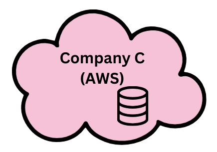
This is the only cloud icon that shows this additional icon, which many technologists would infer to be a database icon. Additionally, this is the only cloud icon that has a parenthetical label ("AWS"), which we can infer to mean that this cloud is related to Amazon Web Services, which most likely means that Company C's systems are hosted within AWS. Further, since this database icon is located on top of the cloud icon, we can infer that this database is hosted within AWS as well.
This one area shows the power of diagrams and the importance of their visual design: with 4 elements (2 labels, 2 icons) and their visual locations, we created a ton of meaning. Unfortunately, in this case, some of it isn't necessary.
The hosting of Company C's services doesn't impact the understanding of the diagram for most users; why does it matter to them that Company C is on AWS? If it does matter, why didn't we label Company A or Company B's hosting? That label can be removed.
Does the database tell us anything new? Perhaps, if we were trying to indicate that it is important for some reason, but most users will assume that data is stored within every cloud provider, so placing it on this element only either implies the others aren't storing data or emphasizes that this storage is more important to the system. In this case, it wasn't and it can be removed.
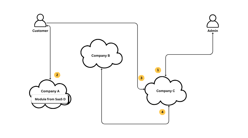
This version is already getting a lot more sparse, but there is a pretty colorful element that stands out to me: what information is the green, blue, and pink colorations of the cloud icons conveying to the Audience? Each icon has a different color, so it can't be communicating any commonality between them, and the variation doesn't really tell us anything more about the fact that they are different systems than the company label or the bounds of the cloud icon itself tell us. Additionally, color variations are usually a poor option, as many Audiences may suffer some kind of partial or full colorblindness that could cause items to look similar in a way we don't intend. In the end, the color in this diagram was probably an attempt to make the diagram more "visually interesting," but at the cost of risking misunderstanding. Why don't we remove it.
This is a lot better! We've removed a ton of stuff and are now down to closer to 20-ish visual elements, but we're not done yet. As I discussed the prior sections, I often talked about the "relationship" between elements. Its time to dive into that.
Meaningless Complexity
Before we move on to visual relationships, there is one last thing that we can do to "remove" elements from the diagram, and it is one that most people don't even think about: we can remove elbows.
Every line in a diagram establishes a connection between two other elements, but in order for the Audience to understand that, they have to trace the path of that line between both elements. Tracing a winding path is much harder than following a straight line, and so we should attempt to iron out as many of them as we can.
Depending on how you count it, this change removes between 6 and 12 elements from the design!
And yes, I did miss the opportunity to straighten the line between "Customer" and "Company A".
Visual Relationships
Visual design is ruled by the idea that the Audiences of a design can and will infer relationships between objects based on their location in the design relative to one another. I won't go through every one of those rules here, as they don't all apply to this diagram, but I will start to layer in those concepts as I shift from removing elements to rearranging them.
The first thing I will do at this stage is to review the story I want to tell via the diagram and the way that I expect an Audience will naturally scan over the diagram to see if those things line up. If they don't, then I need to consider rearranging the items in the design. Although this particular design has labels indicating how the Audience should trace the path through the diagram, you can't rely on that to control the Audience's attention. In order for the person looking at your diagram to even see the labels, they have to have scanned the diagram to look at it, and if the natural scan of their eyes doesn't match your labeling, they will have to devote more effort to intentionally following your diagram, fighting against their natural instincts.
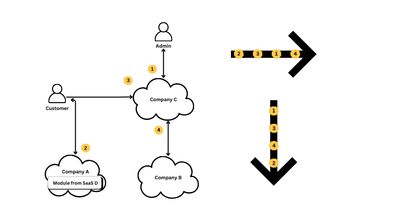
The first test I use is just a simple left-to-right and top-to-bottom scan, which I'll refine in the next step. This scan seeks to check the visual position of which order labels I find when sweeping across the diagram. As you can see, neither approach yields a good result, even with this simplistic test.
I chose right-to-left and top-to-bottom because this matches how readers of the English language scan documents. If your intended audience is from a group that reads right-to-left, you should adjust accordingly.
That test was simplistic, but it does let me know that something is up with the design. A more accurate test is to consider a topleft-to-bottomright scan, branching off significant horizontal and vertical sight lines to major elements. This approximates the concept that users scan content in an "f-shape". I then draw lighter or darker arrows where I feel there is visual weight in the image; lots of elements create heavier lines.
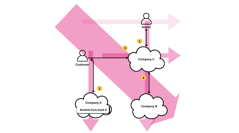
An interesting picture begins to emerge, which is that the top right "Admin" element, the first step in our labeled order, has a very low visual connection to the left-right diagonal cut, which means it is unlikely be the first element the Audience looks at in the diagram. Further, it hints that we should look at the proximity principal.
In this diagram, there are two vertical associations of elements that dominate the layout, with a much weaker horizontal connection. This is important information to me: I'd already determined that I didn't think it was likely that the Audience would see step 1 first, and it further tells me that if they instead start with Customer, which is the next most likely path (given top-to-bottom, left-to-right), then the Audience will probably see Customer first, follow the association to Company A, and then jump to Admin and follow the line down through Company C and then Company B, before maybe seeing the path from Customer to Compancy C. I can immediately tell we have a problem: that flow doesn't match our story, and it runs the risk of confusing information in step 4 because it has a stronger association to Admin than it does to Customer.
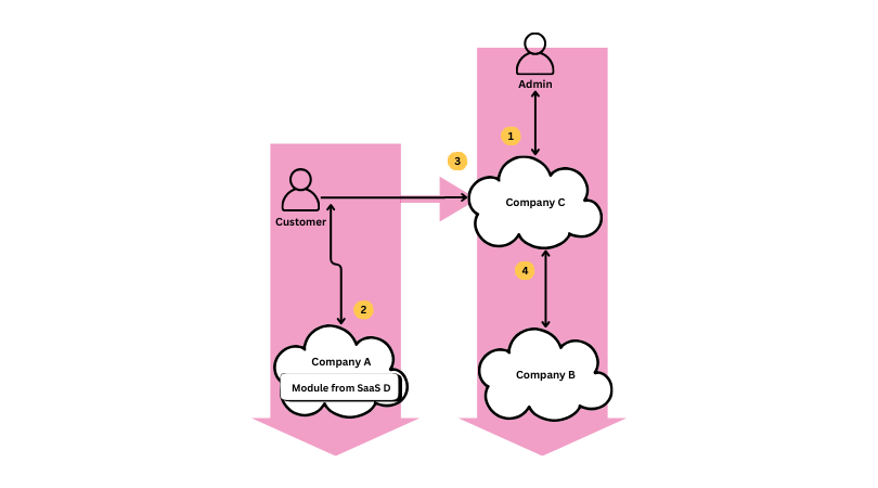
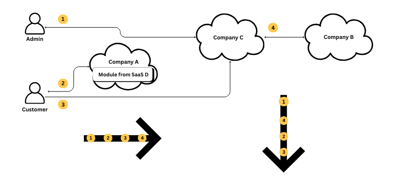
Let's look at that flow:
That order leaves a lot to be desired. Let's see what we can do to change it.
Above is my first attempt at rearranging the diagram. I have intentionally choosen not to adjust the sequence of my labels indicating flow order, but instead rearranged the elements to try and create a more cohesive scan.
You may have noticed that I've reintroduced some elbows to my lines. That is totally OK at this step, as we're trying to increase clarity a different way - if that is successful, we can look again to see if we can retain that clarity and remove the elbows.
Lets apply my simplistic scan again.
Ok, that is a lot better, particularly if we do just a left-right run. Lets look at visual weight:
Because Company A now lies equa-distant between Admin and Customer, the whole thing feels more like one big line than multiple smaller ones. Have we cracked the case? Lets look at the individual step sequence from this.
OK, this is also much improved, but I do still spot a problem. When we rearranged things, because Admin to Company C was labeled step 1, we left it near the top, although the Admin flow is actually quite small compared to the Customer flows. In order to fix this, we need to consider the order of the sequence labels and rearranging the diagram once again.
When More Is More
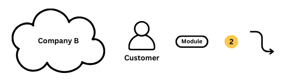
OK, so this flow is a lot better, creating a smoother sequence, but it also brings to light a glaring issue - that "Module" box. I've left it alone so far because it has seemed to represent a meaningful variation, and it does (knowing that something is integrated via a module vs API calls is important), but it is also creating an unnecessary variation: three SaaS platforms are called out as cloud icons, but one is not. Lets take advantage of our now clean lines in order to expand that small box into a visual that identifies the module variation while unifying the approach to showing SaaS partners.
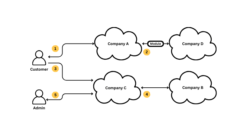
OK, thats a lot better, but, as with most changes, that means looking at the flow all over again. Before we do though, I'll just add a note about the elbows I've left in place here. Although I'll continue to count them against the complexity of my diagram, they serve a useful purpose of preventing emphasizing that each user type isn't hard linked to a sequence of systems, but is disconnected from that. In addition, all of these lines with elbows run left-to-right along the Audience's easy sightlines, unlike in the original drawing.
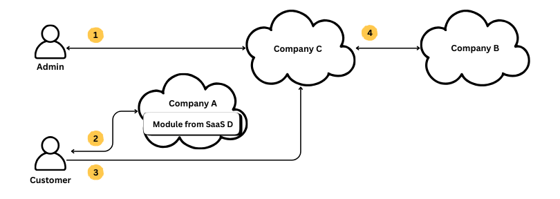
Updated Flow
After a few more nudges to adjust the distance between elements, I'm left with a design that I think supports our overall direction pretty well.
There are now two major horizontal sight lines, but they actually move (mostly) along the lines we want the Audience to follow. The two user type sit off the mid-line of those too, which helps to soften their linear association. That should mean that scanning the first line, left-to-right, the Audience would be to follow Step 3 down to the second line and associate Customer with both Company A and Company C rather than just Customer -> Company A and Admin -> Company C.
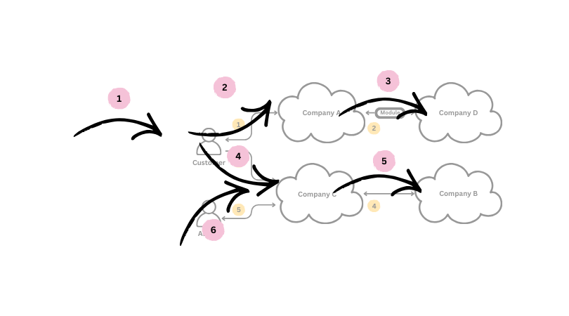
Viewers of this document will most likely follow Step 3 into Step 4 befor backing up to look at Step 5 as they scan along the curve of lines! We're pretty much done.
Visual Refinement
The last step I'll do is to review things like color, portion, and line weight to, once again, test if the visual is reinforcing the message. In this case, lets set aside color, as this diagram has conveyed its meaning without it so far (mostly), and I don't think that a good diagram needs anything to "spice it up." Instead, lets look at the size of the elements, the font size used, and the weight of lines.
Above, you can see each of the elements used in this design: the cloud icon with company label, the user icon with type label, module icon with label, the step indicator with label, and the connector line with arrows. Although these elements are individually fine, they are not well coordinated. The thickness of the lines around the cloud, user, and module icons are all out of whack, and there are three font sizes in use across those elements. Further, the visual weight of the step indicator might be a little strong which can cause them to be distracting.
Think that is nitpicking? Lets look at a variant where I throw those things even further off.
That diagram tells a completely different story! Lets look at our current visuals and make some adjustments to make things more harmonious.
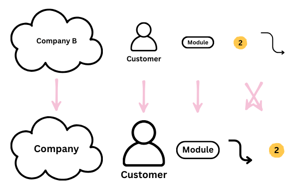
In this updated set of icons, I've made the font a uniform size and increased the size of the user icon so that is less overwhelmed by the cloud icons. I've also increased the weight of the connecting line so that it draws the eye better, allowing the step icons to be a little less important.Keeping the step icons in yellow allows them to be the only element in the diagram with color, setting apart their information from the rest of the diagram, while their relative proportion makes it clear that they are notations or lesser elements. A final, mostly invisible change is that I created a white fill for the user icon; although you can't see it when presented on a white background, its a detail that does matter on slide backgrounds where it enhances readability.
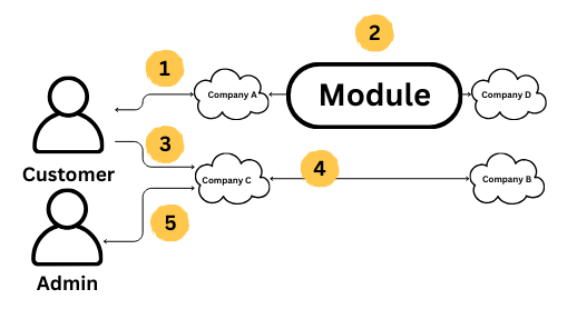
Final Version
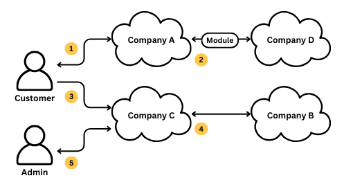
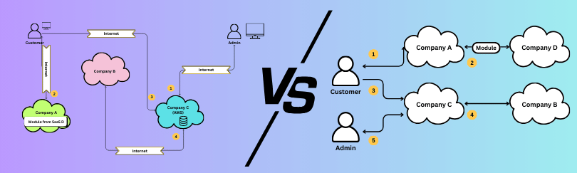
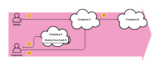
Here is my final vesion - the one I would have been using to present if this was my system. I think this does a very good job of presenting the message for the intended audience:
Audience: A group of technical leaders removed from the daily operation of your systems.
Message: The relationship of users to major vendors involved in this system flow.
Every element left in our diagram supports that message:
Icons:
    user - Specifies user groups in the system
    cloud - Specifies a cloud provider in the system
    module - Specifies modules shared in the system
    lines - Specifies which systems or users communicate with eachother in this solution
    step - Specifies the sequence of communication involved in the system.
    --
    5   - Total Icons (37.5% reduction)

Elements
    2   - Customer: user icon + label
    2   - Admin: user icon + label
    2   - Company A: cloud icon + label
    2   - Company B: cloud icon + label
    2   - Company C: cloud icon + label
    2   - Company D: cloud icon + label
    2   - Company D Module: module icon + label
    7   - Customer > Company A Line: line x 3 + elbow x 2 + arrows x 2
    3   - Company A > Company D Line: line + arrows x 2
    6   - Customer > Company C Line: line x 3 + elbow x 2 + arrow
    3   - Company C > Company B Line: line + arrows x 2
    7   - Admin > Company C Line: line x 3 + elbow x 2 + arrows x 2
    10  - Step Sequence: step icons x 5 + labels x 5
    --
    50  - Total Elements (24.2% Reduction)

Unique Visual Combinations:
    user icon + label
    cloud icon + label
    line + arrows (1-2)
    step icon + lable
    module icon + label
    --
    5   - Total Combinations (28.5% Reduction)
I'm happy with were I landed, although if I was trying to game the counts of elements, I could try to change the alignment of the user and cloud icons to remove additional elbows. I've decided that isn't helpful here as doing so would threaten to strengthen the horizontal association of elements too much. The current offset layout helps to prevent that which makes the element complexity worth it.
I hope this walk through my thought process sparked your imagination in connecting the world of visual design to technical diagrams!